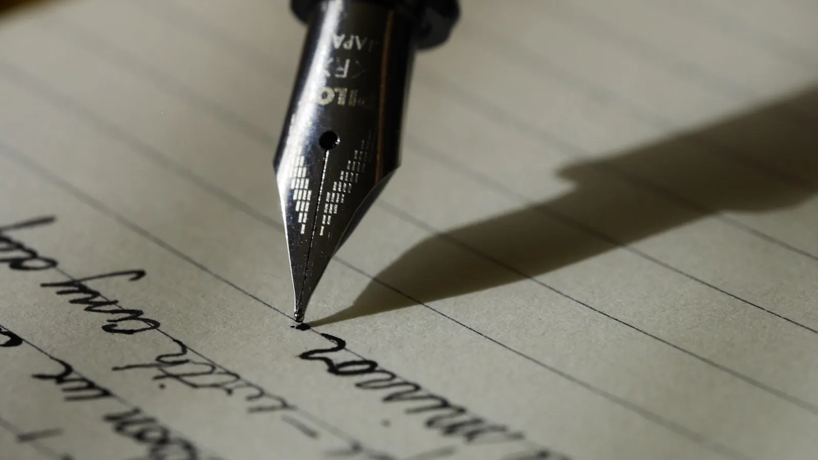
Typography is where brands are won and lost in the least visible way. Most people can’t name a single font — but they can always tell when something feels cheap, corporate, or “off”. That’s type doing its work. Here’s how we choose it without getting carried away.
Start with the voice, not the font
Before we look at a single specimen, we write down how the brand should sound: warm but precise. Confident but not shouty. Established but not stodgy. The typefaces are then a search for a voice that matches — not a hunt for the prettiest letterforms.
Two voices are enough
A brand rarely needs more than two typefaces: one for display, one for reading. Adding a third is a cost, not a benefit. Even two is a stretch for some identities, where a single family with a range of weights carries the whole thing.
Our default pairing: a characterful display face for headlines and a quietly excellent text face for the long reads — the paragraphs, the product descriptions, the legal small print that suddenly looks a lot more trustworthy.
Legibility is the brief
Display type gets to be expressive; text type has to behave. For body text we look for:
- Tall x-height and open counters, so letters don’t clog at small sizes.
- Generous default spacing, so we’re not fighting the font’s instincts.
- Good italics, because the web is full of them and ugly italics show immediately.
- Real small caps and old-style figures for dates, prices, and addresses.
None of these appear in a splash screen. All of them appear in the sixty hours a month your customers spend reading your site.
Respect the licence
This is the unglamorous part and the one that bites hardest. A font licence must cover the number of people, the platforms, and the usage — a retail licence that covers a PDF may not cover a web app with 10,000 users. We always confirm licences before we commit, and we’re careful about free fonts that carry surprise terms.
Test in the real places
We check chosen typefaces in the places they’ll actually appear: a phone screen at arm’s length, a 12pt paragraph on a grey background, a headline over a photograph. Fonts that look divine in a specimen PDF often disappoint in the wild — and it’s far cheaper to discover that in week two than in week twelve.
The long-run test
Trends come for typography hard. We avoid the faces that are everywhere this year and ask a simple question instead: will this still feel right in five years? The best type choices are the ones that, once made, you stop noticing — because the words are simply a pleasure to read.
That’s the ambition. Good type should never be the reason someone remembers a site. It should be the reason they never think about it at all.